You must log in or # to comment.
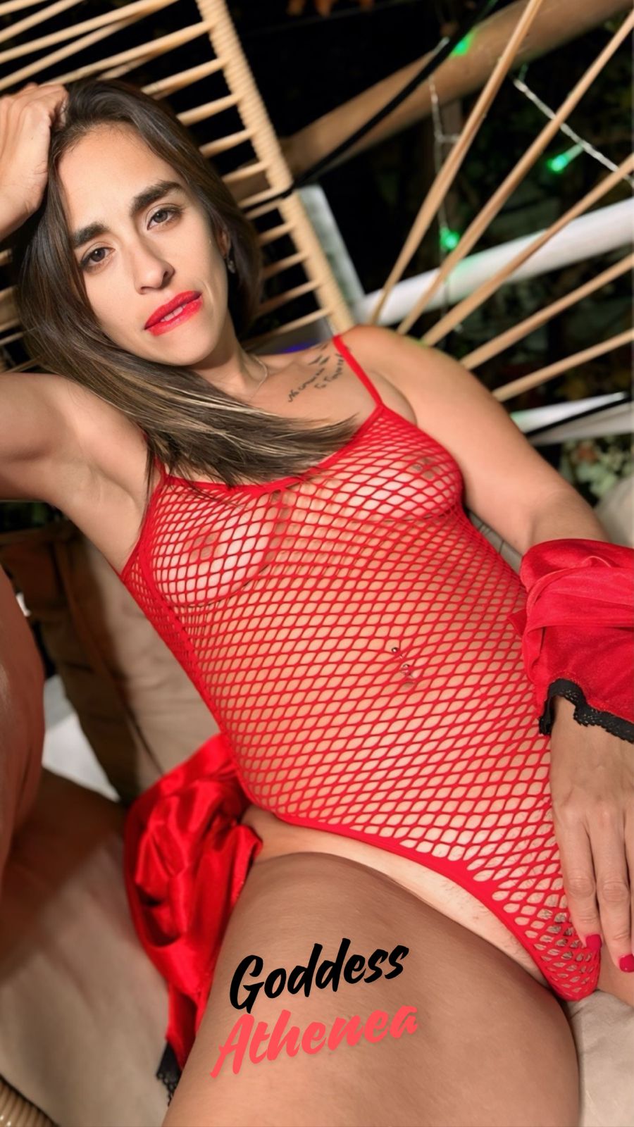
2, the first picture does not do you any favors.
it’s good to not have your face lighting obstructed.
Clearly 2. Although I prefer the look of your eyebrows in 1. They feel slightly too strong in 2 and take focus away from where it should be. Open lips in 2 are just right. Lighting isn’t doing you any favors in either though. A hint of a nipple base draws just the right amount of attention and guides the viewer through the shot. In your shot, contrast feels too low to really capture the eye with the nip.
Removed by mod
2
2
2


