Another remaster that misses the point
Today Blizzard announced remasters of its classic fantasy real-time strategy hits Warcraft I&II, the games that put it on the map in the distant, functional past of the ‘90s. I should be celebrating; the second Warcraft as unequivocally my favorite game as a young child. I spent God only knows how many hundreds of hours playing it, and even He eventually got bored of watching me make my own horrible little maps and walked away. These remasters, though? They ain’t it.
I’ll preface this by saying that I’m very glad these classics remain playable. I’m sure Blizzard’s making a pretty penny off doing so, but at least it’s keeping its history alive. That said, I will be playing these re-releases with the new graphics turned off, because just look at them:
Warcraft Remastered Battle Chest Launch Trailer
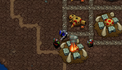
The art looks basic and generic where the original pixels inspired imagination, letting your mind fill in the gaps of these units’ physical features. Some, like Ogres and Ogre Magi, appeared almost photorealistic to young me, who sought to recreate them (over and over and over) in drawings and other, larger-scale art projects. In trying to more fully inhabit this universe whose collection of Little Guys inspired me to dare to dream, I constructed life-sized (relative to an eight-year-old) paper dolls of nearly every unit in the game. It was my Everest, entirely because – again – the original game left room for interpretation.
Now admittedly, I’m no longer a small child fueled entirely by starry-eyed wonder, and that’s definitely part of the problem. But Warcraft’s original look was a product of its limitations, and trying to pave over that with plastic-y sheen is a mistake. I don’t know who the new graphics are for – I doubt these old games are going to lure in many new players, especially with art that looks like it belongs in a vastly less-intricate game than Warcraft – but it’s certainly not me.


the “original graphics” settings in D2:R are far worse than what D2 actually looked like. I dont know exactly whats wrong with it, but if you actually have D2 and run it, it looks much better.
Oh you’re not wrong! There’s a special filter you can enable in settings that makes it look more true to what you would have seen on a CRT monitor. When first switched to original settings I was like “absolutely no way it was this shitty” hahahaha