
ThatOneKirbyMain2568
- 52 Posts
- 41 Comments

 6·4 months ago
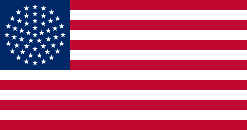
From what I can gather, this particular design was proposed by Puerto Rico’s New Progressive Party (Partido Nuevo Progresista or PNP), which advocates for Puerto Rican statehood. The circle definitely has its appeal, though I think I’d prefer something closer to the current flag.
 1·4 months ago
From what I can gather, this particular design was proposed by Puerto Rico’s New Progressive Party (Partido Nuevo Progresista or PNP), which advocates for Puerto Rican statehood. The circle definitely has its appeal, though I think I’d prefer something closer to the current flag.
 1·5 months ago
Maybe home-grown human intelligence (HGHI)?
The Northern Territory has what’s probably my favorite Australian flag. Idk, that shade of brown is just really cool. It’s like candy.
I want to eat the flag.
 4·5 months ago
…Who exactly is asking for this? AI chatbots are cool and all, but I have no idea why you’d want them in your messages app. What would you even need that for?
Oop, forgot to post the symbolism. Just posted that in a separate comment.
When I was going through redesigning all of the U.S. state flags, this is one of the first designs I made. Here’s the symbolism:
-
The colors are reminiscent of the orange, white, & blue pattern used in many of New York’s state flag.
- The blue has been replaced with the purple of the Iroquois flag.
-
The white shape in the center holds several meanings.
- It resembles a crown to represent New York being the Empire State.
- It points upward to represent New York’s motto: “Excelsior” (“Higher”).
- It looks somewhat like tall skyscrapers because duh.
-
This is my take on a flag for Kbin, a fediverse thread aggregator like Lemmy (and the one that I use). There isn’t that much to the symbolism behind it. There’s magneta because there’s magenta in the logo, and there’s a slash to go with the shape of the logo.
I also used this flag for the icon of this community’s Kbin equivalent: @vexillology.
When I was going through redesigning all of the U.S. state flags, this is one of the first designs I made. Here’s the symbolism:
-
The colors are reminiscent of the orange, white, & blue pattern used in many of New York’s state flag.
- The blue has been replaced with the purple of the Iroquois flag.
-
The white shape in the center holds several meanings.
- It resembles a crown to represent New York being the Empire State.
- It points upward to represent New York’s motto: “Excelsior” (“Higher”).
- It looks somewhat like tall skyscrapers because duh.
-
While I’m never a fan of coats of arms on flags — displaying the coat of arms is what, well, the coat of arms is for — this is actually pretty solid. The background is a Scottish flag with swapped colors, which makes sense given the province literally being called “New Scotland”, and the royal arms use a small set of colors that go well with the rest of the flag.
Since I already like Rhode Island’s flag a lot, I didn’t want to go too far from the original design. I decided to make the following three changes:
- The background was changed from white to blue. I felt yellow on blue popped a lot more due to the higher contrast, and it helps a lot with the nautical vibe.
- The “HOPE” ribbon was removed. It’s fine, but I prefer the flag without it.
- The ratio was changed from 29:33 (🤮) to 1:1 to match maritime signal flags.
This flag was used by the Great Socialist People’s Libyan Arab Jamahiriya. As you can see, it has a very intricate design rich with symbolism.
This flag was used by the Great Socialist People’s Libyan Arab Jamahiriya. As you can see, it has a very intricate design rich with symbolism.
Fun fact: The escutcheon (shield) of the Jamahiriya’s coat of arms is similarly detailed.
Continuing with the trend of vexillological organizations having their own flags, the Flag Society of Australia has one. While the flag within the flag looks really cool and has a nice color palette, I think the flag as a whole looks a bit odd. The Southern Cross looks weird since its stars are crowded closer together but not shrunken themselves, and the arrangement of everything just doesn’t work imo.
But you see, they did it with triangles.
I also preferred the stripes, but I’d say this one is more than okay. I think opinions would generally be more positive if we didn’t have the original design to compare to. A downgrade, but still a great flag nonetheless.
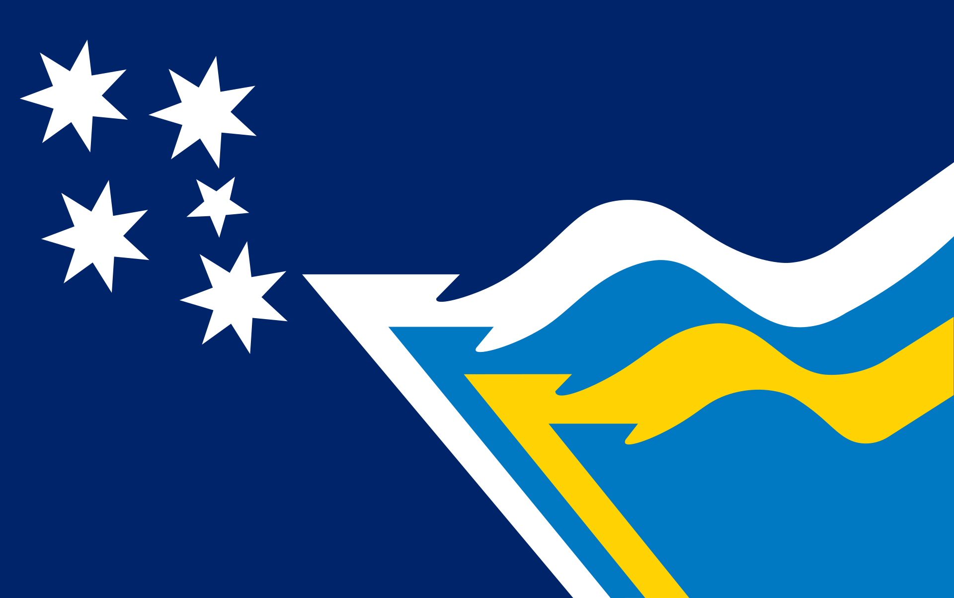
I think this is a really nice flag! It’s a simple, satisfying design separated from others by the unique color palette (consisting of very wintery colors, btw) and the inverted chevron resembling the shape of the state. I miss the stripe in the middle, but it’s still an awesome flag as is.
It’s also helpful to see it waving, so here’s a photo of that.
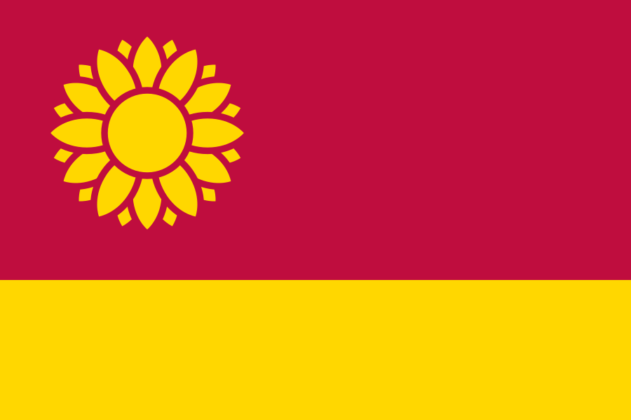
When I made this flag, I used red to symbolize the violent history of the Kansas Territory, a yellow stripe at the bottom to evoke a wheat field (given that one of Kansas’s nicknames is the Wheat State), and a sunflower at the top left. I didn’t notice the communist connotation of a red flag with a yellow symbol in the canton until someone pointed it out back when I posted this on Reddit. I still really like how the design looks, though maybe it’d be best to change the red to blue.
Yeah, the one with alternating rows is the one I see most and the one I’d prefer. You make a good point about the circle being different though. Honestly never thought about it that way, but with that in mind, I can see why the PNP would opt for something like this.